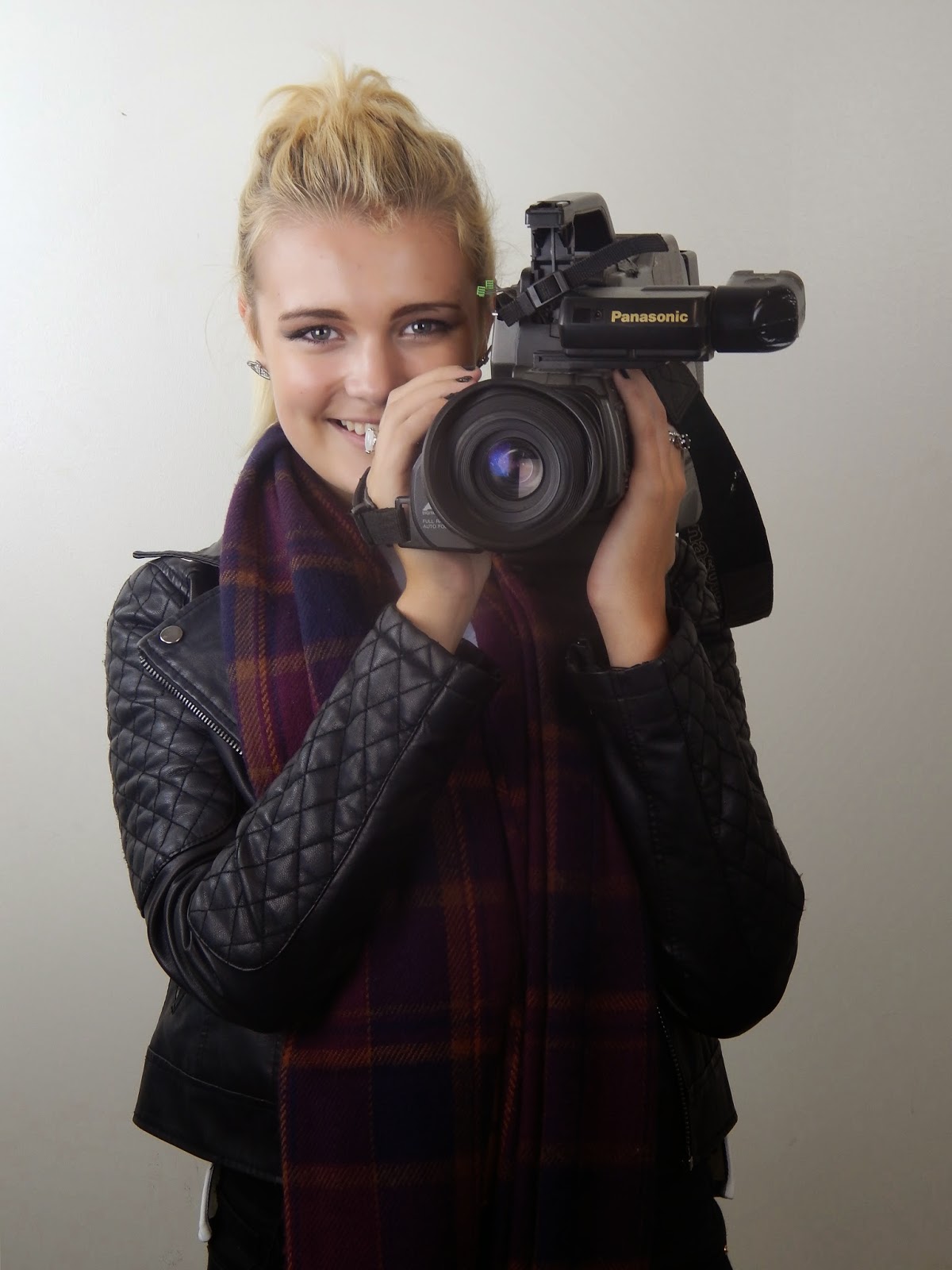
I have decided to use this photo in the design on my college magazine front cover. I think the use of the photography studio in the college was the best possible location. It is far superior that using a photo where the location is on campus. It is my best photo as the background is minimal; the audience's focus is drawn solely to the model and her prop which directly link to the main feature. Using the photography studio was also beneficial as you could control the level of brightness which was helpful as it was a very dismal day when we scheduled to take our photos. I also prefer this photo as the prop the model is holding is linked with the main feature (Wyke TV). It shows continuity and a definite thought process throughout the whole concept of the front cover design.

No comments:
Post a Comment