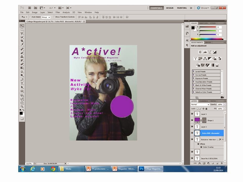
I created a new PhotoShop document and selected the correct size, width, height, etc. that was necessary to create my magazine's front page.
I opened my the photo I wanted to use on my magazine's front page.
I dragged the photo onto the front cover page.
I then went on transform and then re-scale and adjusted the size while holding shift to ensure it stayed in proportion. I adjusted the size of the photo to fit the page.
I then inserted text into the document.
I then adjusted the colour to purple; my college's colour.
After experimenting with various effects, I settled on this style for the masthead.
I then inserted some more text to explain the magazine's content in the same style, only much smaller.
I then inserted my main feature in keeping with the colour scheme.
Afterwards, I wrote in my other smaller features with subtitles.
I then inserted my offers blurb's text.
I then placed a shape onto my cover as a background for the offers blurb's text.
I placed the text on the shape; this vibrant shade of purple will help the offers blurb stand out and catch the audience's attention.
I then opened an image of a barcode and re-sized it and placed it on my front cover.
I placed the price onto the document. I then re-sized it, changed the font size and setting before rotating it horizontally.
I then inserted a white box and changed the order so that it would appear to be behind the pricing and act as a background.
I also added white boxes behind the main feature, smaller features and subtitles as I realised that it improved the visibility of the text.


No comments:
Post a Comment