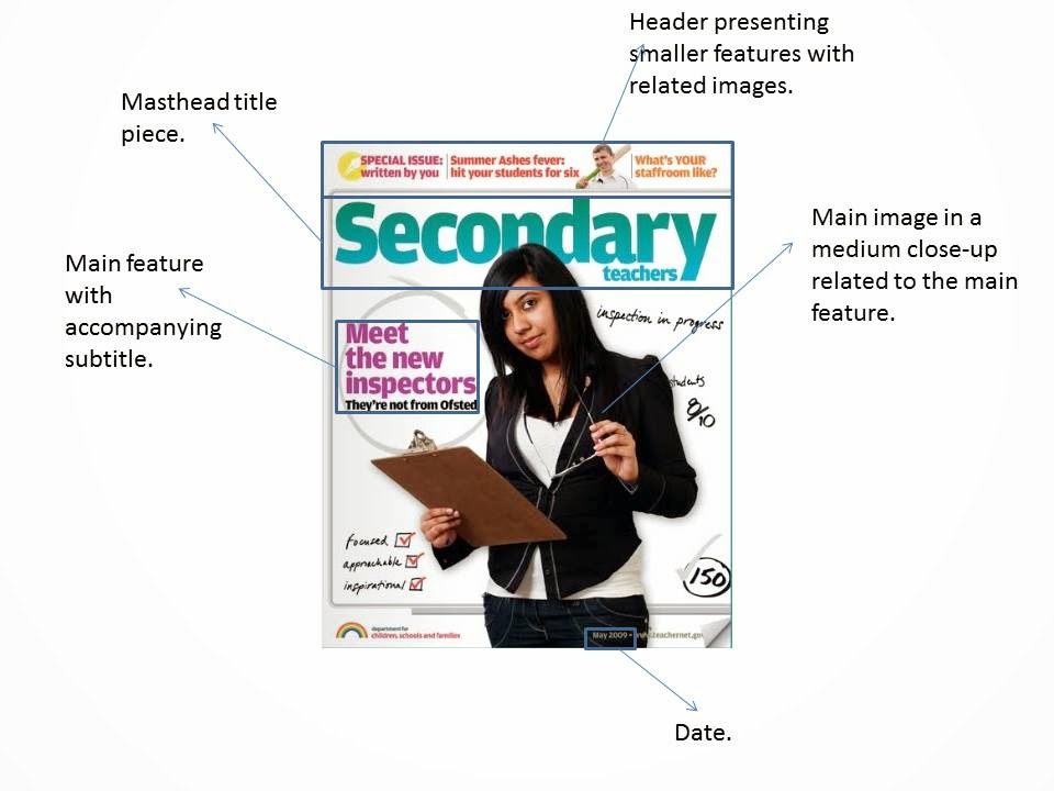
The main image is of a young, aesthetically pleasing girl.
This shows, without knowing it is a college magazine, that it is a magazine
from that age-group; this implies that the institution authorising this cover took into consideration
what model should be used (representation). She is also smiling, this tells us that she is happy
to be at college and that the audience should also share her attitude to
college, representing the institution's ideology. She is also wearing a t-shirt
which is patriotic to her college, an outward sign that she is proud to attend
her college and the audience should have that view in common with this girl, this will be the institution's ideology. This relfects the institution's idea of what a college-goer should be like. The fact that only the model is in focus shows that the photographer is
somewhat professional and that the contents of the magazine will be as professional,
this encourages the audience to read it. One of the smaller features forms a
question, this is effective as it involves the reader and makes the reader
think that it is directly addressing them; making it personal. The price or
lack thereof is also effective. It doesn’t say its ‘free’ but ‘100% free’ this
assures the audience that there will be categorically no cost for this magazine
and also entices the reader in as everybody loves to get something that’s
absolutely free. The colour themes of the masthead and smaller features are
coordinated with the colours of the model’s costume. This theme helps shows
continuity in the cover and makes it easier on the eye. The fact the main image overlaps the masthead
shows that the magazine is professionally made and creates the promise that
this isn’t an amateurish attempt, it is skilfully made.
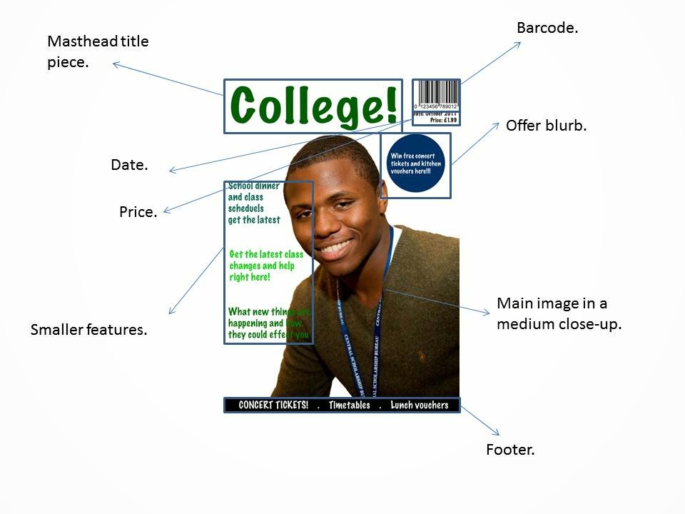
The main image is of a young, attractive male.
He is also black showing that this college is multicultural and acceptant of
everyone; this defies the stereotype and representation in the media that all young black men are
involved in gang culture and criminal activity. This implies that the institution
provides young black men with an alternative to gang culture and saves them
from it and moulds them into successful individuals and is a part of their philosophy. He is also carrying a book
on ‘law, business and society’; this challenges the assumption that he would be
studying a less academic subject based on his fashionable costume. This conveys
the idea that this institution will let anyone attend and will not stereotype or
pigeonhole anybody. Again, the use of layering the image over the masthead
shows professionalism and shows that this standard will remain the same
throughout the magazine. The colour scheme from the cover is greyscale and a
bright green; this creates an air of professionalism but not without a trendier
edge to it. This colour theme would appeal to college students or the audience. The only
feature that doesn’t fit this theme is the offer blurb which is neon pink. This
is so that the offer stands out at first glance and it is where your gaze is
brought to first, this is to make sure the blurb gets maximum attention; the
advertisers will want the most acknowledgement of their product as possible.
The main feature is written in a bigger font than the rest and is place at the
top left hand corner which is where people read first in our society, this is
to show it is their main feature.
The main image is of a good-looking, youthful female, her
appeal will attract people to purchase the magazine with the message that if you
buy this magazine you’ll be more like her. You’ll be less worried about studies
and such because you have bought this magazine and it has all the answers. The
model’s costume is fashionable yet ‘wholesome’ (i.e. not showing too much
skin). This represents the institution’s ideology of what a young female student at
college should dress like. She is still young and hip but also more maturely
dressed than some people at her college would be. There is an effeminate colour
scheme of vibrant yellow and pastel blue, the small features and main image
also seem to be targeting female members of the student body. Perhaps this
magazine has a more specific target audience than mere college-goers. The use
of questions is a direct address to the reader and the magazine becomes, as a
result, more personal. The use of abbreviation/slang in one subtitle (‘‘nuff
said’) also ups the appeal to a younger audience as they will feel that the
articles are been written by someone like them and they can identify with the
writers and magazine as they’re using words and phrases that generally only
young people use. The content boasting ‘interviews with…90210’ also shows that
this is a magazine for the young, and more specifically female, as they’re
interviewing the cast for a young person’s T.V. drama.


No comments:
Post a Comment