The Evaluation.
What you learnt from completing this task?
I have learnt, from completing this task, a myriad of new skills as well as building upon old ones. The main new skill I learnt was how to use Photoshop in greater depth than I ever have done before. I have made some valuable notes and learnt some important, new skills which will help me when I need to design my music magazine front cover and contents page.
I have also found some stylistic choices when producing a magazine that I like and may splice into my music magazine like having the features placed over a background.
I have also built on my knowledge of camera angles and learnt the correct and appropriate terminology from certain camera angles. For example, the accurate terminology for ‘a worm’s eye view’ is actually a ‘low angle’.
I have also had time to reflect on which of these camera angles will and won’t work on the cover of a magazine which will benefit me when I have to make these choices in regards to producing my music magazine.
I have also found an effective method of planning a magazine. I have learnt to mood-board and brainstorm ideas on a cornucopia of different features like: the colour scheme, the main feature, the mise-en-scene et cetera. I will revisit this method of pre-production when it is time to design my music magazine’s front cover and contents page.
I have revisited and learnt some new key media vocabulary and have endeavoured to understand it and use it in my deconstruction of college magazines and explanation of semiotics. This will not only be useful when I need to create my music magazine but this will also be paramount to my examinations also.
I learnt that, when taking photos, it’s imperative you take a smorgasbord of photographs. Taking a minor amount of photographs will not suffice; you need to ensure you have an abundance of photographs to choose from. The chances are that your first few photographs will have floors so you need to take plenty to ensure that you don’t get stuck with a mere few photographs all with imperfections. These words I will adhere to when creating my music magazine.
What technology have you used and why?
I have used various different varieties of technology in different ways. Firstly, I set up a blog so I am able to submit my work electronically. The benefits of this are; I do not need a printer nor do I need to carry all my documents around with me in a physical form, I can go back and edit my work conveniently if I need to and I can submit my coursework little by little yet it is still all in the same place and easily accessible.
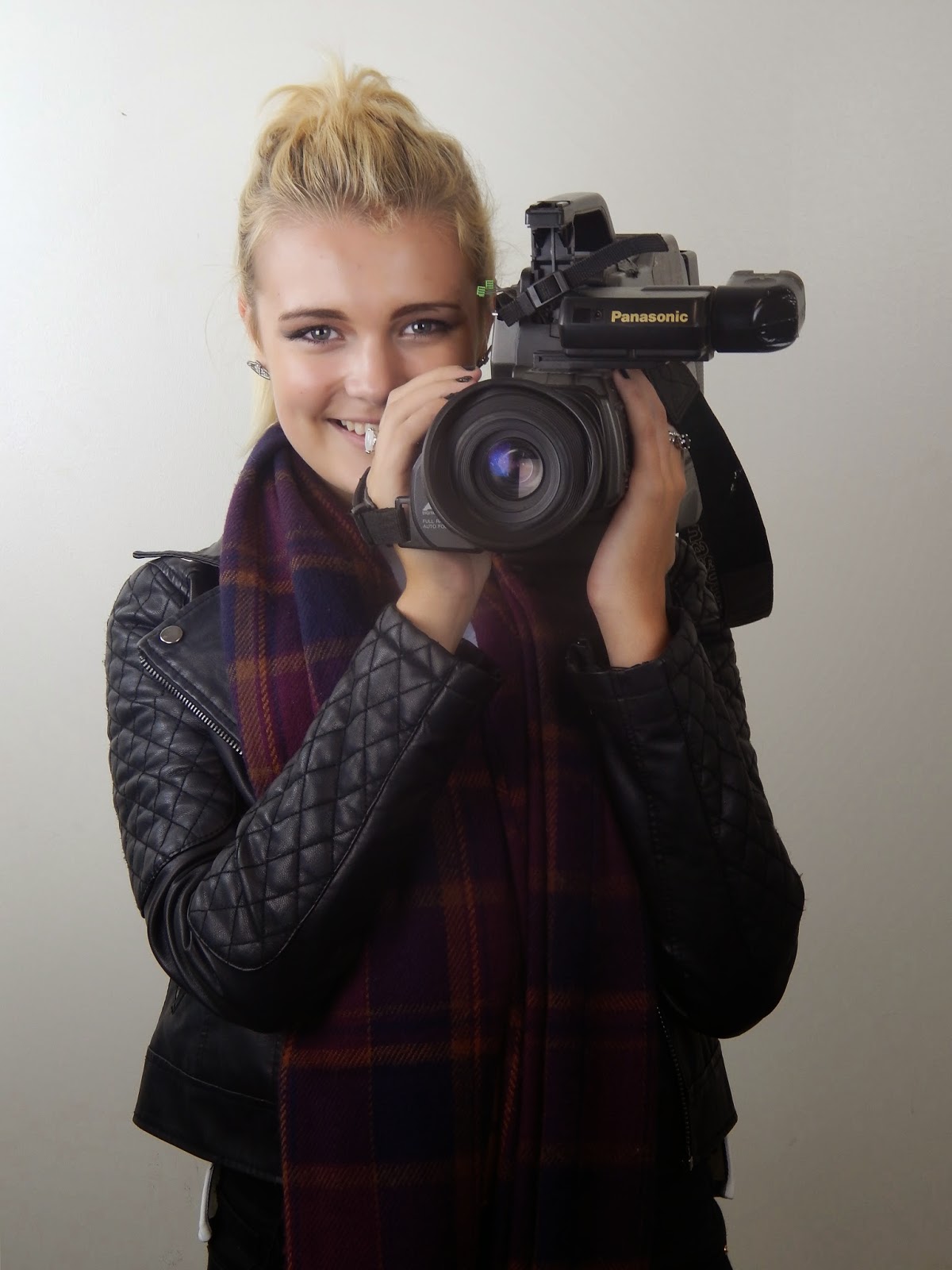
I also used my own camera to take all the photos I have submitted to my blog. I used a camera instead of say, the camera on my smart phone as the photo quality of my camera is by far superior to my smart phone’s camera.
I also decided to bring my own to college as I didn’t want to have to rely on the media department’s cameras. It was far more time-effective to bring my own and use that instead of having to wait for use of one of theirs which were shared between the class.
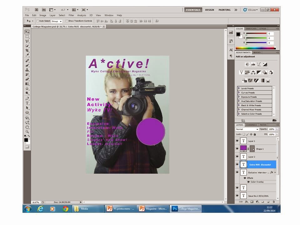
I utilised Photoshop as well, this was the software I used to create my college magazine and was fairly easy to navigate and use once I had an introductory lesson to it.
As well as using modern technology, I also used classic pencil and paper to create my primary drafts for my front cover and contents page. I find this helpful as it is a lot more easy to create a draft on paper and then digitalise it, rather than going straight into producing a digital draft.
Speaking of digital drafts, I used PowerPoint to create my more developed magazine drafts with my paper drafts as guidance.
To enable myself to post my hand-drawn drafts onto my blog, I scanned them and thus created a digital version. I then posted said drafts onto my blog.
What conventions have you used and why?
My magazine with the coventions labeled-
I have used a myriad of different magazine conventions. I have used a masthead title piece to make my magazine easily identifiable; the masthead is a convention the audience expect from a magazine. A magazine’s name makes it individual and something the audience can rely on for continuity.
In my masthead, I also included some smaller text below the magazine’s name (‘A*ctive’) which said ‘Wyke College Enrichment Magazine’. I did this to explain to new potential readers what the subject matter of the magazine actually was as the magazine’s name isn’t too obvious in telling the audience what the magazine actually contains.
I included a main feature, which is easily identifiable as it the feature that is written in the largest font-size and is also the on furthest up the page, I have chosen to include a main feature as it immediately tells the audience what the most interesting and sellable story actually is. Including an obvious main feature on the front cover will command the audience’s attention and, hopefully, boost circulation.
I have also included smaller issues (which are in a smaller font size and below the main feature) to try and further persuade people to buy the magazine that weren’t interested by the main feature. Smaller features acts as a failsafe plan and will hopefully include something that would interest the possible-reader if the main feature doesn’t. They also reassure the audience that this magazine isn’t just a ‘one trick pony’ and has other articles to boast besides the main feature.
I have also included an offers blurb that will, again, entice the audience in. it shows that they’re not just buying the magazine when they purchase; they’re also getting something much more. It better sells the magazine as the audience will feel they’re getting more for their money and everyone loves a bargain.
What would you change if you were to do this task again?
With an opportunity to do this again, I would address the
various flaws in my approach to this task. One of which being taking the
photographs displaying my knowledge of different camera angles three times,
this isn’t something I’m proud of. The first batch was insufficient as my
camera ran out of batteries, the second I missed out taking a long shot and the
third were finally acceptable. I think this laborious task could have been avoided
with better planning and being well-equipped. I will learn from my errors and
ensure that this doesn’t repeat itself when I take my photos from my music
magazine.
I also think having more than one location available on the scheduled shooting day of my college magazine photos would have been ideal. My partner and I requested use of the balcony overlooking the campus which was fine but due to the poor weather and I not having the prop (a camera) on hand I wanted to go to the photography studio. We were able to do this and the shoot was very fruitful but it wasn’t without some waiting. I think if we’d have requested the use of more than one location when we were planning would have been more time-efficient.
Aside from my problems with the photos, another issue I had was with my hand-drawn drafts; as they needed to be uploaded to my blog, they needed to be digitalised. Let me tell you that setting up the scanning programme on my printer and computer was not easy. To prevent this, I should have given it some forethought and set it up before it was imperative to do so.
My biggest issue with the task is actually in my completed magazine cover itself. When inspecting it before beginning this evaluation, I realised that the offers blurb doesn’t quite fit with the rest of the cover, I feel like if I could repeat this task I would alter the blurb. I would endure that the blurb seemed more professional and skilfully designed; in keeping with the style set by the front cover in general.


