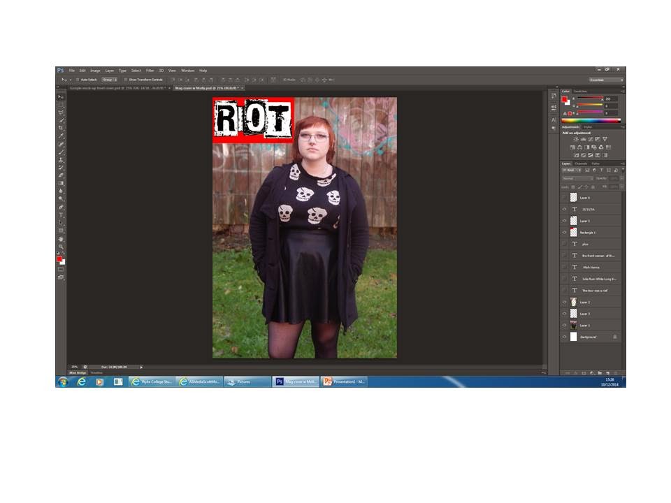
I re-sized the image to a medium shot.
I blurred the background by using the lasso tool to cut around the artist and created separate layers for the background and the piece of the background in between the model's stride. Then I blurred those two layers and put the layer of the image of the artist above it.
I inserted the magazine's logo and put the date of release in the bottom right-hand corner of it as text. I also used the eraser tool to work at the red square and make it look as it the model's image is above it.
I then inserted the barcode and price.
I then entered all of the features and positioned them as to not conflict with the artist too heavily.


No comments:
Post a Comment