Friday, 12 December 2014
Thursday, 11 December 2014
Wednesday, 10 December 2014
Photoshoot (Attempt #2).
I took inspiration for the model's smudged makeup from a Beth Ditto photoshoot in which she had mascara rolling down her visage.
I enjoy these photos and find they represent perfectly the Riot Grrrl mentality: smudging makeup is an attack on society's ideals on beauty and femininity.
Progress Update.
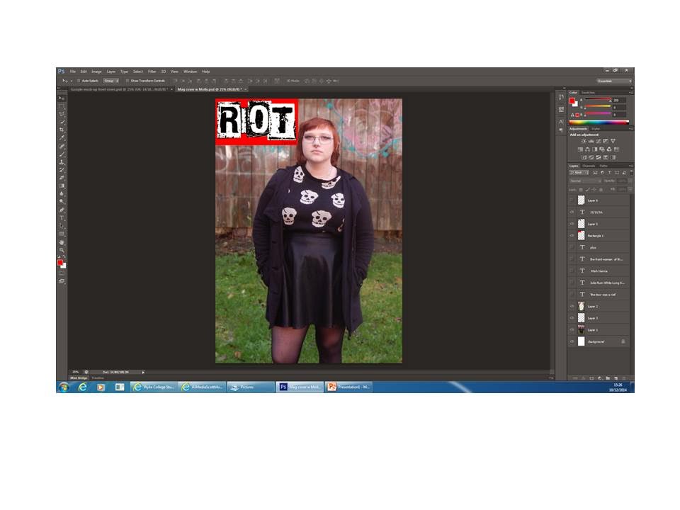
I have decided to re-take my magazine photos with a different model and a studio as the location. I wasn't happy with how my photos appeared on the magazine cover and aim to emulate a more definite Riot Grrrl theme in my next photoshoot.
Front Cover.
I re-sized the image to a medium shot.
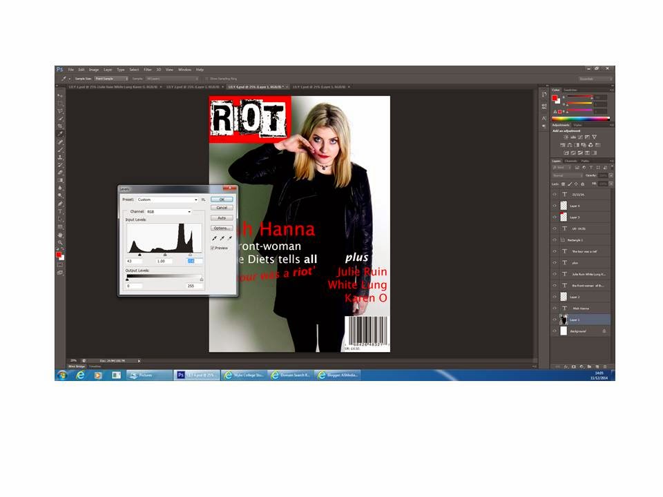
I blurred the background by using the lasso tool to cut around the artist and created separate layers for the background and the piece of the background in between the model's stride. Then I blurred those two layers and put the layer of the image of the artist above it.
I inserted the magazine's logo and put the date of release in the bottom right-hand corner of it as text. I also used the eraser tool to work at the red square and make it look as it the model's image is above it.
I then inserted the barcode and price.
I then entered all of the features and positioned them as to not conflict with the artist too heavily.
Front Cover Google Mock-Up.
I re-sized the image so that it only displayed the front woman of the band 'White Lung'.
I blurred the background of the image to draw more focus onto the model.
I imported the barcode I was planning to use.
I then inserted a square shape and coloured it red.
I then imported my logo to place on top of the red square, this is the logo for the magazine.
I then placed all of the text that I planned to have on my front cover. I arranged it so that the main feature (that the image relates to) is of a larger font size and on the left, since that is where Western audiences begin to read.
I later realized that I had not put a price on my mock-up. I amended this immediately and placed the price over a square of white underneath the barcode, as is common magazine convention.
Subscribe to:
Comments (Atom)


