My double page spread is the beginning of a much larger feature. I used the same typeface for the title as I have done in my contents page and front cover. I also, to create continuity, used a polaroid boarder.
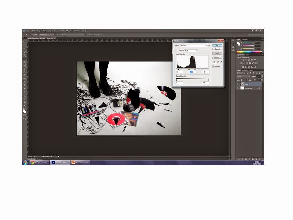
I opened my image and adjusted the levels to make the colours in the image more vivid.
I experimented with the brightness and contrast of the image.
I imported the words that were to create the title of the feature.
I arranged them into order and then found out, roughly, where I wanted them to go.
I then opened the polaroid boarder.
I resized it and cut our the white boarder surrounding the image.
I imported, cropped and then resized an image to go within the boarder. I also changed the levels of the photo.
I grouped and then rotated both the image and the boarder before opening the page in publisher to insert the first part of my article.


No comments:
Post a Comment