To improve my front cover; I re-sized the image, moved some of the features, added more features and made the barcode and price smaller.
Friday, 13 February 2015
Double Page Spread and Printscreens.
My double page spread is the beginning of a much larger feature. I used the same typeface for the title as I have done in my contents page and front cover. I also, to create continuity, used a polaroid boarder.
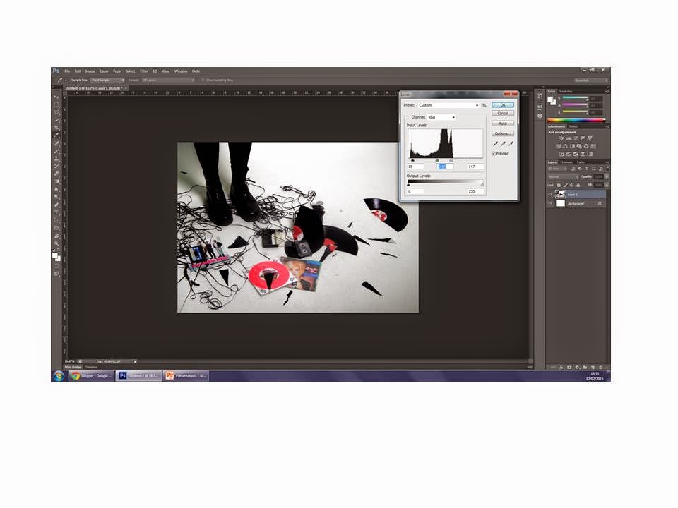
I opened my image and adjusted the levels to make the colours in the image more vivid.
I experimented with the brightness and contrast of the image.
I imported the words that were to create the title of the feature.
I arranged them into order and then found out, roughly, where I wanted them to go.
I then opened the polaroid boarder.
I resized it and cut our the white boarder surrounding the image.
I imported, cropped and then resized an image to go within the boarder. I also changed the levels of the photo.
I grouped and then rotated both the image and the boarder before opening the page in publisher to insert the first part of my article.
Contents Page and Printscreens.
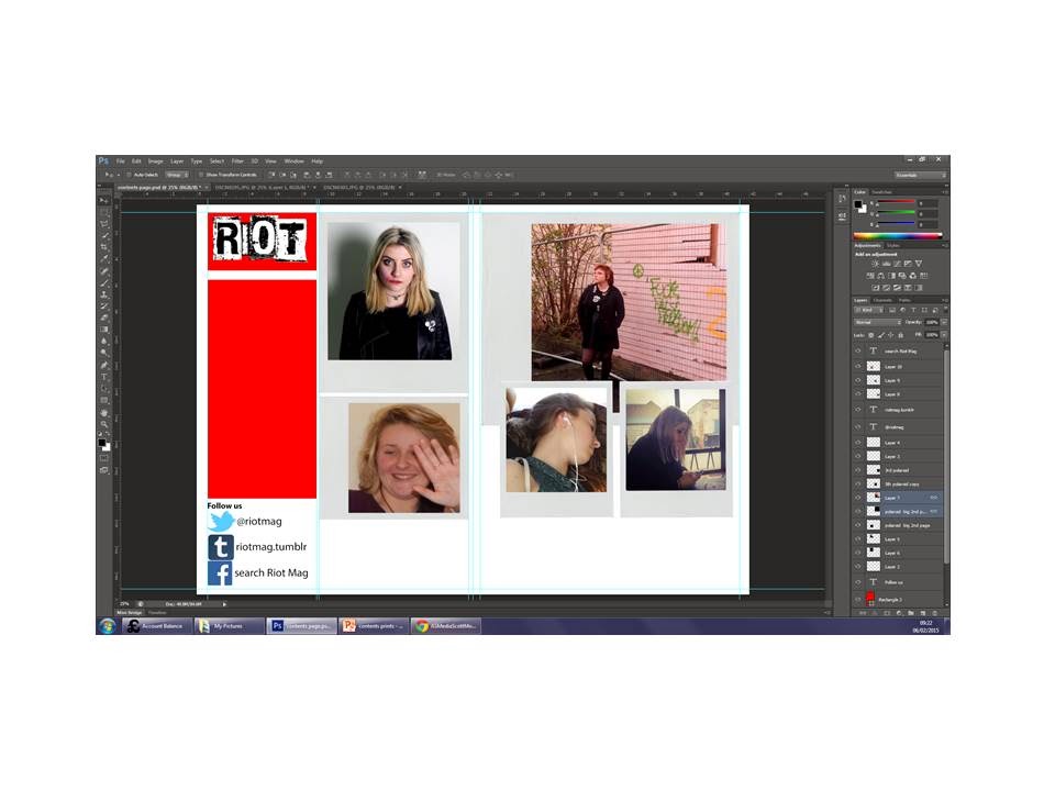
My contents page was inspired by the 'Classic Pop' contents page; I wanted to emulate having large images with the contents running along the bottom. I used one image which to show my main features, which is the same as my front cover and double page spread. I also used an image from my first (and unsuccessful) photoshoot. I placed all my images on polaroid boarders and numbered them to correspond with the contents at the bottom, I also put link to various social media sites. I used the same typography for the magazine name and the 'Contents' as on my front cover to create continuity.
I began by opening my 'Riot' masthead.
Similar to my front cover, I inserted a red rectangle to act as a background for my masthead.
I then, like in the Classic Pop contents page, added another red triangle to act as a background for the word 'Contents'.
I first of all decided that I wanted the page title ('Contents') to come down in a column. However after separating all of the letters and rearranging them, I decided to have the word 'Contents' coming down horizontally.
I opened various logos of social networking sites, like in Classic Pop.
I then inserted text, which showed links to the magazine's pages on social media sites.
I then inserted the image, relating to the main feature which would appear on my double page spread as well as my front cover.
I then cropped it down to fit in a polaroid boarder.
I then inserted a black rectangle to act as a boarder but I did not like this.
I found a better polaroid boarder from the Internet to utilise.
I then spent time copying, organising and re-sizing polaroid boarders.
I began to insert photos into the boarders and experiment with levels, brightness etc in order to give the images a retro camera, polaroid aesthetic.
I inserted more photos and edited them
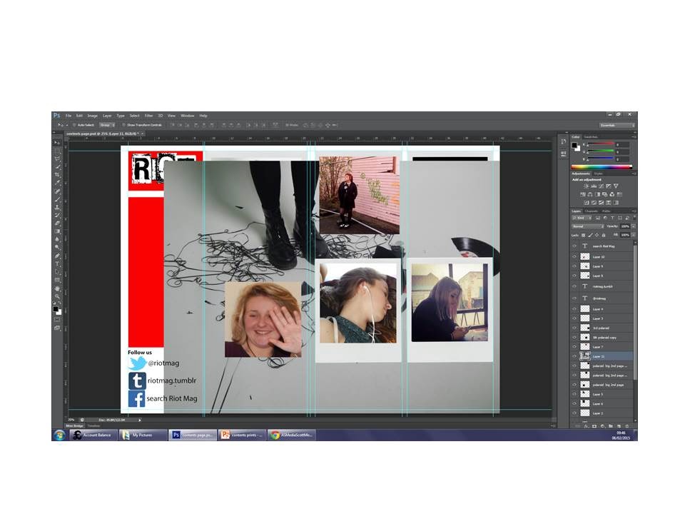
After experimenting with the layout of the images, I finally got an order that worked.
I decided to swap the image of the boots for another since I wanted that to feature in my double page spread.
I then saved the page as a j-peg file and opened it in publisher to add my text in columns.
Subscribe to:
Comments (Atom)


