- Be critical- retake photos, rework designs, use photo manipulation.
- Show development of your work- accompany screenshots with images and comments.
- Frequent posts- sometimes short and snappy is better than essays.
- Use a broad range of media- Prezi, Goanimate, Slideshare, Youtube, mobile videos interviews and production shares.
Friday, 23 January 2015
How to achieve an A*/A/B.
Thursday, 22 January 2015
Notes for Double Page Spread.
- Double Page Spread and Contents Page due in on the 14th of February.
- DPS- A3 landscape.
- All photographs and graphics are produced in Adobe PhotoShop.
- The body text written in publisher.
Friday, 16 January 2015
Contents Page: Examples.
This is one page of a double spread contents page from 'Classic Pop'. I like this aesthetic since it has large photos at the top with page numbers, you don't have to read the text at all to find out what artists are in the magazine.I think this layout with large photos would make the best out of my aesthetic choice to use polaroids.
Polariod Film Boarders.
I think I would like to use colourful boarders on my contents page if I chose a minimalist background.
Contents Page: Polaroid Mood Boards.
Polaroid Cameras are extremely popular amongst in the alternative Zeitgeist currently. Rookie magazine often feature polaroid shots in their publication and many Tumblr bloggers own a polaroid camera. They're valued currently for their retro aesthetic and Urban Outfitters stock an extensive range of polaroid cameras and film.
I think that using a polaroid aesthetic for the photos in my contents page will appeal to my target audience sine that look is commonplace in Rookie Mag, Tumblr and Urban Outfitters.
These photos were digital images but have been manipulated and given a polariod boarder for purely aesthetic reasons, I found them on Tumblr. They are of indie/alternative musicians such as Grimes, St Vincent, Lana Del Rey and Marina Diamandis.
This theme has become so popular that pop artist Taylor Swift has used a polaroid as an album cover and put an extensive collection of polariods as an insert for her album.
This shows that a polariod aesthetic is very hip and current; it would work very well in my contents page.
Thursday, 15 January 2015
Research: Sassy and Rookie Magazines.
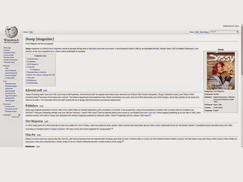
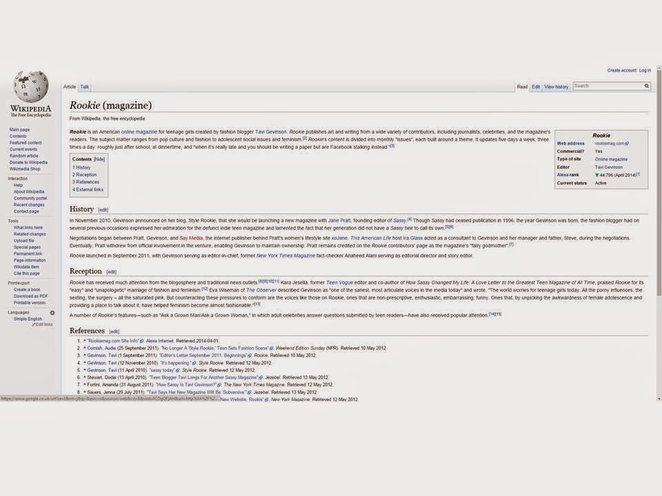
Sassy Magazine was a publication that was extremely popular during the nineties; the magazine's main target audience was alternative teenaged girls. It reported on the latest indie music but also fashion, film and social issues such as feminism.
The modern equivalent of Sassy magazine is Rookie Mag. It has a huge Internet presence with an official website and Tumblr blog. It also publishes magazines with a 'fanzine' aesthetic and reports on the same issues as Sassy did previously. I should perhaps make an effort to mirror the aesthetic of both of these magazines since they have the same target audience as my magazine are concerned with the same topics: feminism and alternative music.
Friday, 9 January 2015
Contents Page Deconstruction.
This is my favourite contents page from the three I have chosen to deconstruct. I like the fact that this NME contents page has moved away from using the convention of a standard 'features' of a contents page. I like the collage theme and how lots of artists have their article featured with an image related to it, unlike on Kerrang's where they only feature one artist heavily on their contents page.
Subscribe to:
Comments (Atom)


